Design | 2022: A Year for Color
Written by: Elyse O'Dwyer
Photography by: Various
It’s said that design trends change about every ten years, and here at HBL we’ve noticed the “vibe shift.” Neutrals such as grays and wood tones recently dominated the home space but as we move forward through the 2020s, neutrals are now aided with texture and color – and we love to see it! We’re seeing a smattering of the decades; gem tones of the 20s, vibrancy of the 60s and the earth and warmth of the 70s.
We spoke with four amazing local design trend setters who toured us through some of their favorite 2022 design choices featuring these great color trends.
J. PATRYCE DESIGN & COMPANY

Joan Enger of J. Patryce Design & Company says “we are finding a return to warmer, inviting tones along with openness for more saturated color and pattern.” Joan says they approach color with timelessness in mind and like to do a mix of them while incorporating vintage and antique pieces. When it comes to splashes of color, Joan likes to create moodiness with warm shades like teal, plum, ochre and rust.
Here we see the trend of bringing in nature for a neutral with an inky blue that brightens the natural beauty of the wood grain touches while the patterned chair adds interest, Joan says “We are really into dark trim with light walls at the moment. It elevates the overall look and feel.”

The above design features the modern warmth clients are tending toward right now with a clean palette, using texture, light, and natural wood shades to an advantage creating an opening inviting tone, explains Joan.

Keeping with the trend to move away from drab neutrals and heavy grays, the design here has a metallic warmth, highlighting wood grains and letting the natural light of the space shine.
DONI DOUGLAS DESIGNS

Jaclyn Isaac of Doni Douglas Designs says the #1 request she’s getting from clients right now is moody cocktail rooms and transforming the “living” room into “entertaining spaces.” She let’s color do the work to match the energy of a space and asks “what is the energy of the room that we want to bring out?”
This green sofa adds a pop of color without taking over, it’s a “safe pop” that doesn’t require green elements added elsewhere to feel cohesive, Jaclyn explains “velvet and olive leather are classic materials that age really well.”


LUNA ROSA HOME

Diane Stiglich, owner of Luna Rosa Home loves the transformative effect harmonious colors and textures can have on your space. When it comes to selecting what colors to surround yourself in, Diane says, “memory plays a big part, it just matters that it makes you feel good.” Diane’s methodology has to do with trusting your gut and experiencing the objects you select. Her store is set up to be a tactile experience so when you’re selecting items for your home you can come in and feel and touch and see the scale.
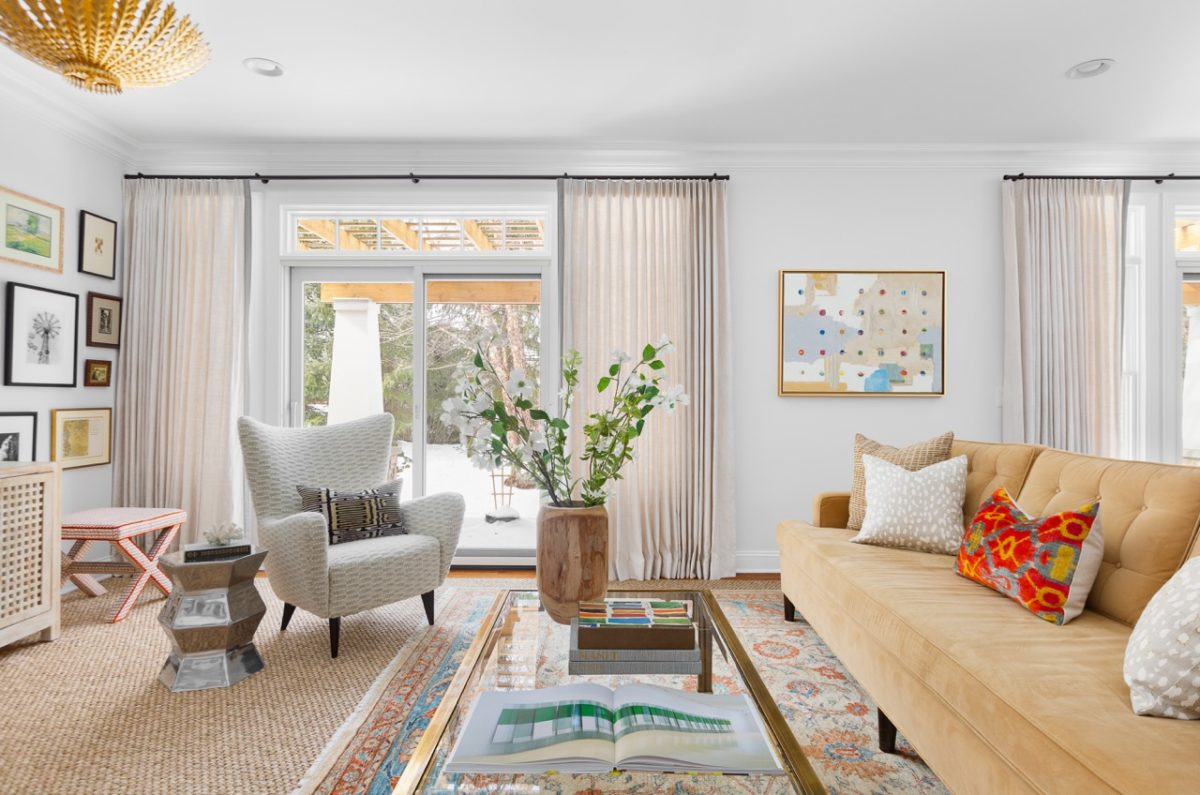
Shades of yellow and gold are bringing warmth into design this year. Diane says, “I chose mustard because it’s everywhere right now and because we’re shifting from silver to gold.” It functions as a lovely accent color that plays well off of neutrals.


KATE SUSANNAH HOME

Kate Jacobowitz of Kate Susannah Home says of the current trends she’s seeing they ”evoke the feeling of a cozy, lived-in, authentic space.” The colors feel timeless and balanced.” She says that neutrals are getting more varied and featuring deeper, earthy colors that are “softened with dusty pastels and taupey pinks.”


Color trends are cyclical and this moment emotionally harkens back to a post-war return to color. There’s a marriage of joy and ease in use of color in design right now that feels simultaneously comforting and exciting. Designers are featuring rich colors mixed with interesting neutrals and adding in shades we see in nature like blues and greens. Homeowners want to feel the emotion of their space and the authenticity and personality in their color schemes and designs.
See more design trends and exquisite aesthetics here.

